Benu is a Russian company that makes fountain pens with wonderful names, with interesting shapes, and with beautiful patterns and colours. I’ve been wanting to try one for a while so was very happy when Scribble lent me his to look at.
This review will form part of a meta-review over at United Inkdom sometime soon.

Price: $90
Filling method: international standard cartridge/converter (a converter costs an extra $5)
Barrel options: various colours with wonderful names. This one is called the Friendly Chameleon. Some colours cost extra
Nib options: stainless steel in extra-fine, fine, medium and broad
Size: 13.7cm long capped
Weight: 20g
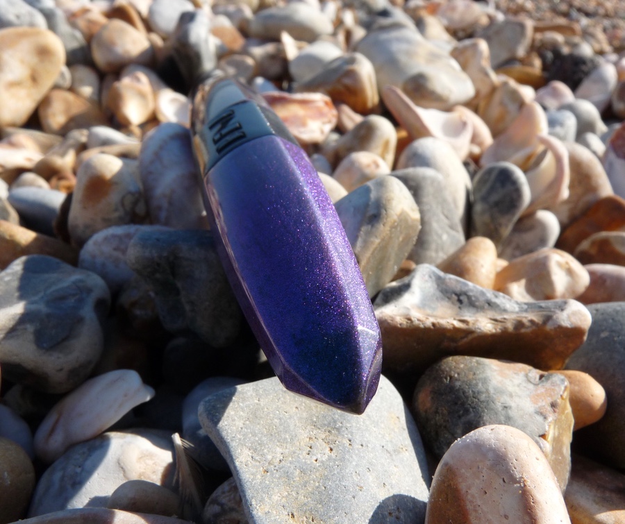
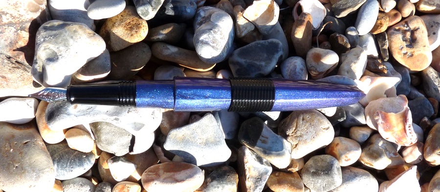
What’s most striking about this pen is of course its appearance. The cross-section is roughly triangular and the barrel looks like a futuristic torpedo.

The wide black band around the middle is the end of the cap. One face has the Benu branding and the others are ridged.

The blue resin has sparkles and swirls and hints of black and purple.

There are three little grooves towards the end of the pen. These secure the cap when it’s posted. The cap pushes on to post and screws on to close. I like that the cap always lines up with the barrel when you close the pen.

I absolutely love the resin used in this pen. It’s one of those barrels tempts you into picking it up and swirling it around in the light. I’m not so keen on the black band around the middle, I think it cheapens the look, and I don’t like the notches used to hold the posted cap in place. While they’re very useful they give the pen an unfinished look. Overall, though, the Friendly Chameleon (what a great name) wins on looks.
The pen uses an international standard cartridge or converter, which is always a good thing.

The nib is a #5 Schmidt. It’s functional and has a good flow with no hard starts or skips. It’s got a little tooth to it and it’s quite stiff. It’s okay but I’m not a huge fan of Schmidt nibs (they work well but they’re not fun) and this one doesn’t do anything to change my mind.

In hand the Chameleon is very comfortable. It’s light. The black section is long so your fingers are out of the way of the threads which, in any case, are thick enough not to be a bother. Unposted it’s a compact pen that’s long enough even for my big hands.

Posted, it’s a long pen but still balanced as everything is so light. It looks good, posted, too.

It isn’t perfect but nevertheless I like the Benu Friendly Chameleon. It’s completely functional and it looks different but still lovely. The colours in the barrel are stunning. If I could, I’d have a different nib in it and I’d have the resin continue throughout the length of the pen. Then this good pen would be, for me, great.

Pros
Stunning barrel colours
Fun and interesting shape
Comfortable to hold and write with
Nib works well
Cons
Some design choices cheapen the looks of the pen (in my opinion)
Nib is stiff and could be smoother


I do not often say a pen is ugly. When unattractive I use to say the pen is dull. Or boring.
But this one!!! Sorry but I first thought it was a 10$ pen. At that price, open a Staples catalog, all pens look like if they come from a distant galaxy, designed by a twisted alien brain. And I mean it’s okay I guess. These are pen to loose, through on your desk or to a colleague for fun, and help you to loose your handwritting…
At 90$, this pen is ugly.
This was my first reaction. I went to see Benu’s site and… oh yes that pen is ugly!
Most of their work on the resin is pretty nice, but the general form of their pen (including the cameleon) are really not my cup of tea. Too “bold” I would say.
That’s a pity because usually speaking Russian design is pretty interesting. Different, but interesting.
At least it’s a pen that provokes a reaction! I like how it looks and I think the resin is better than any $10 pen. But I can see how you’d feel how you do.
Indeed, it provokes a reaction. As I say, the resin looks really nice (they have a glow in the dark model) but the general shape… may be thread for the cap too bold… I don’t know.
You said some details might cheapen the look… I guess you nail the point.
Thanks anyway to let me (us?) Know that brand.
Pingback: BeNu Friendly Chameleon fountain pen review | United Inkdom
My issue with the pen, based on pics alone, since I don’t own one, is the abrupt edge mid-pen an inch down from the grip. Not a very elegant design, altho I will say, the way they use resin and colors in the barrel is pleasing to the eye, but the pen, open, cap off, mmmmm no.
I actually own the Lucky Chameleon already, and I guess needless to say, I’m fond of this unusual design. It’s shimmery teal and inky black with greenish-gold glitter. I know, kind of garish to some, but I’m a color junkie, and it appeals to me. Also I like that it doesn’t look like every other pen out there. The shape is functional since it doesn’t roll, so that’s a plus. As for the little grooves that hold the posted cap on, I like those for their function. Since I always post my pens, I don’t really notice (much) what this one looks like when the cap isn’t posted. However, it is possible to have a cap click on to post without those little grooves. Maybe that’s a cost saver. I would agree they could’ve done that better, but it doesn’t bother me. As for the nib, I got lucky (no pun intended on my Lucky Chameleon) and mine writes very nicely. But I don’t think I’ll start collecting every color. One is enough. Or, maybe two…I might get that one that glows in the dark…. 🙂