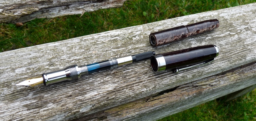
Italix pens are made exclusively for Mr Pen, a family owned British online pen retailer. The names of the pens in the Italix range are wonderful: The Parson’s Essential, Churchman’s Prescriptor and Viper’s Strike, amongst others. This pen also has a rather splendid name: English Curate.
Thank you to Mr Pen for sending this pen for me to review. This pen has also been reviewed by my United Inkdom colleagues so watch out for a meta-review there coming soon. Once that review goes up, we will be giving this pen away to one lucky reader.
Price: £80
Nib options: oh my goodness, whatever you want (as long as it’s steel): 19 different options, in fact. Plus a 18k gold medium nib for an extra £56.40, if you must. This one has a 1.1mm stub.
Barrel options: candy, blue pearl, sable (this one)
Filling system: international standard cartridge/converter (converter included)
The English Curate is a medium length pen, very comfortable to write with unposted but designed, really, to be used posted: the cap posts deeply, with an internal spring which holds it in place on a barrel that’s shaped to accept the cap. Having said all that, I personally prefer to write with this pen unposted. At the opposite end, the cap screws closed.
The 1.1 mm stub nib on my pen is gorgeous. It’s smooth, gives a nice line variation and is wet without getting out of control. It’s started writing every time, even filled with Emerald of Chivor and hasn’t even hinted at a skip. Decoration-wise it’s quite plain and generic.
The hardware is also plain and generic. Small scale pen makers, I assume, have to use off-the-shelf components if they’re to keep their costs down so the trick is to pick components that do the job well and don’t cheapen the pen. The English Curate just about manages this. The nib is fantastic and the rest of the hardware is simple but solid feeling. It’s chrome plated and looks fine, the only weak spot being the clip which doesn’t quite live up to the quality of the rest of the pen.
This extends to the converter as it’s a standard international size. This is fine, as it means there are lots of cartridge options.
I would never choose a marbled brown pen myself. The marbling effect is well done, with a nice deep shimmer. I don’t like the colour but that’s my own personal taste. I won’t judge you if you think it’s beautiful.
Not everyone likes metal sections as they can become a little slippery with extended use and they inevitably pick up fingerprints. I don’t tend to find that’s an issue for me and this one has a nice shape to it that, along with the tapered barrel, lends the pen a distinctive contour.
I really like this pen. If it was the candy version rather than the sable version, you’d have a fight on your hands to get it off me. An Italix pen is firmly on my to-buy list.
Pros
Gorgeous nib
Lots of nib options
Posts deeply and securely
Distinctive shape
Cons
Clip feels a little cheap


That’s a nice looking pen (I like brown!). It’s a curious design, what with the step-down in with the rear of the barrel, but I understand why it’s there.
My Parson’s Essential is excellent, so I will get another Italix eventually. Perhaps the English Curate is next.
I can testify to the excellence of the Churchman’s Prescriptor. Mr. Ford’s nibs are wonderful.
Beautiful photography and a well-written review. Final photograph of the pen with a journal really shows how it writes. Nice work.
Thanks Bob.
Pingback: Italix English Curate Fountain pen review | United Inkdom
I got the Parsons Essential with medium italic. Skips badly (first with J Herbin then with Pelikan Edelstein).
What a shame. Have you asked for the nib to be fixed or swapped? It’s a faulty pen and you ought to be able to get it sorted out
Hello. I know this review is from a couple of years ago, but can you remember if the brown pattern was printed onto the pen? Or was it an actual marbled material? Thanks.
I have a feeling it was actual marbled material.